Magazine
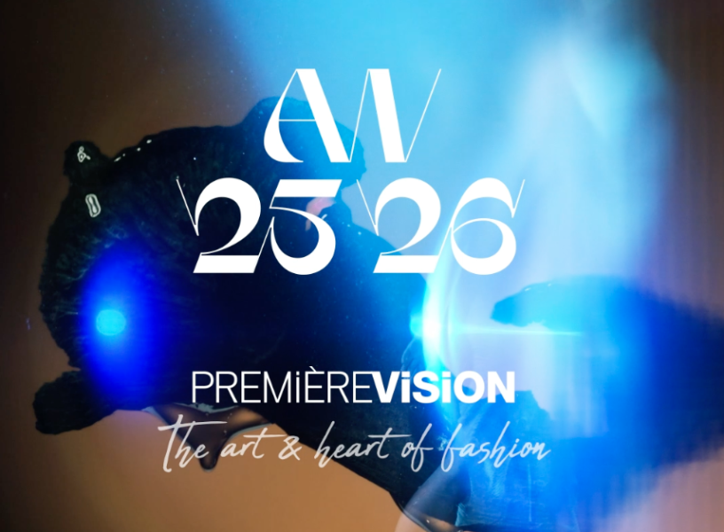
The AW 25-26
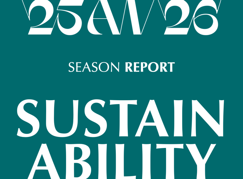
Season Report
All the fashion information for the season—key trends, highlights and innovations
in this inspirational white paper designed to accompany
the development of your future collections.

The AW 25-26 Season Film by Quentin Lacombe
New windowWATCH NOW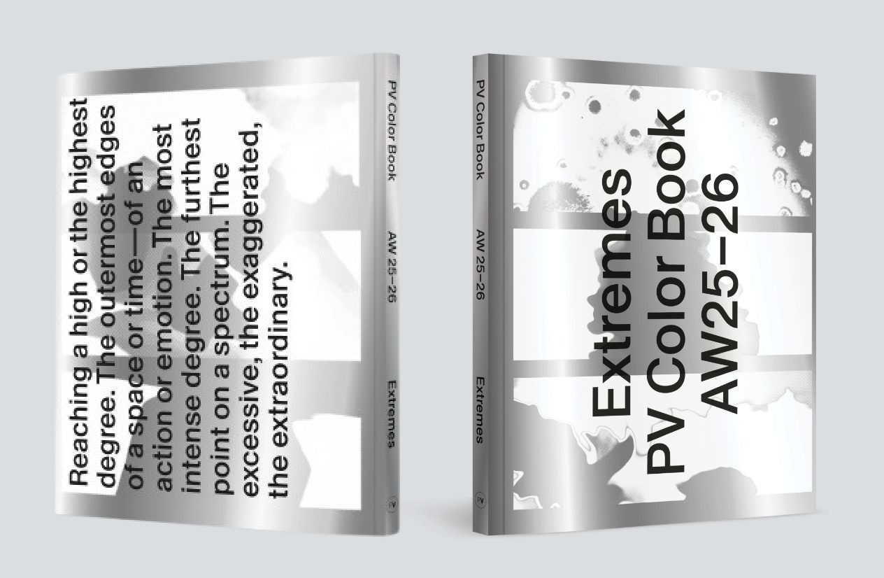
The 27 colors of the season
New windowORDER NOWAll the news